|
So how do you to become familiar with the UK's electricity grid? You need some data, and luckily there are some brilliant websites out there that can show you what the grid is doing all day every day.
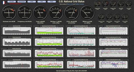
Gridwatch also has a similar webpage for the French Grid that is equally informative, mostly because the French grid is so different to ours and it can tell you a lot. Gridwatch GB's best feature by far however is that it has archived all the data since 2011, providing a valuable resource for data analysts, professional and students alike. I know I will be using this resource for a future blog post but sadly, this treasure trove of data and the website itself is under threat as the website owner struggles with financing. I urge those that can donate to do so. 2. Earth Notes: GB Grid Intensity 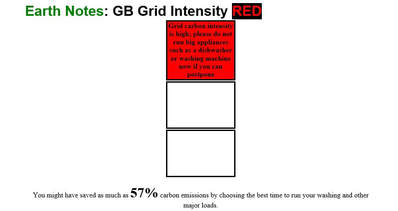 Earth Notes: GB Grid Intensity. Follow the traffic signal indicator before you decide to use your washing machine or dishwasher to reduce your carbon emissions. Mother Earth will be grateful. Earth Notes: GB Grid Intensity. Follow the traffic signal indicator before you decide to use your washing machine or dishwasher to reduce your carbon emissions. Mother Earth will be grateful. Something that Gridwatch GB is missing is a value for the grid carbon dioxide emissions. As our ultimate goal as a planet is to reduce our carbon dioxide emissions (usually shortened to the chemically incorrect label of 'carbon emissions' or even more infuriatingly 'carbon') this value is useful to know. The site uses a traffic light indicator to help visitors know whether it is a good time or a bad time to use energy intensive appliances such as dishwashers of washing machines thereby reducing carbon emissions. While I don't agree with the use of a grid average carbon emissions value as an indicator for when to use energy intensive appliances, (I prefer a marginal cost analysis instead but it's more complicated) it's great to see that a website offers any sort of indication to people on how they can do their bit to reduce carbon emissions. Hopefully, our smart meter devices of the future will do this automatically, so we don't have to keep checking this website. 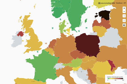 Electricitymap.org: See the electricity grid generation mix data for countries alongside interconnect electricity flows and windmaps. Seriously this map is so cool and fun, they should teach it at schools. Electricitymap.org: See the electricity grid generation mix data for countries alongside interconnect electricity flows and windmaps. Seriously this map is so cool and fun, they should teach it at schools. The two previous websites have been a warm-up for this immense interactive electricity map of the World. Not only can you see information on the electricity grid generation mix in your country but also in loads of different countries around the World. See how the UK compares to the rest in carbon emissions (we actually do very well...).The map also features wind flows and levels of sunshine that are fun to play with and the interface is interactive and natural. The best thing about this website is how cool is looks, part eye-candy and part educational tool it is a wonder and I would recommend it to museums, events and science teachers alike to spur interest in our electricity network (and it is a network which you'll realise once you've seen the map). While using the map is free and they have an API for others to use, the company behind it is a profit making company and so they keep all the historical electrical data for sale which is a negative for all us data analysts, but completely understandable if it pays for the upkeep of this map. 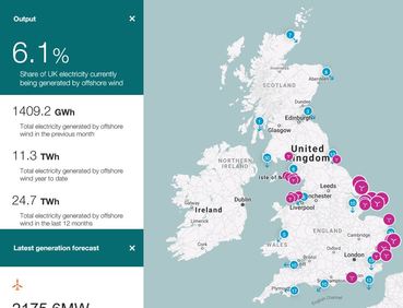 The Crown Estates - Offshore Wind Generation: ____ Watch the modern windmills go around and around. The Crown Estates - Offshore Wind Generation: ____ Watch the modern windmills go around and around. Another interactive map this time detailing electricity generation from all the offshore wind farms in the UK. The map gives an overview of wind generation and it's contribution to the grid but also allows you to pick out individual wind turbines (in case you have a favourite...) Offshore wind power is another surprising success story here in the UK for it's grid, and slowly it will only get bigger and bigger as prices continue to drop. This map is fun to use alongside the Electricitymap.org website with the windflows option active, as you can see the wind blow on the Electricity map.org website and the matching wind turbines turn on the Crown Estates website. This website also has a lovely 30 day output graph which highlights clearly the problem with wind power, sometimes it's windy and producing several gigawatts and sometimes it's doldrum quiet and wind produces next to nothing. Wind is set to become the most prevalent and cheap renewable energy source, but alongside it we have to get some massive-scale electricity storage ideas. 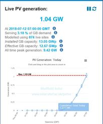 PV Live: Look at all the sun-power, even here in the UK!☀️ PV Live: Look at all the sun-power, even here in the UK!☀️ The original success story in renewables was the explosion of interest in home and small scale solar panel electricity generation following the very generous subsidy from the UK Government. The UK Government later tried to backtrack but it was too late and the solar PV market underwent a mini economic explosion in only a few years. The subsidy has since been turned way down, and the market slowed and matured but home solar panels have never been cheaper and are still a worthwhile investment (although long-term) in your property and the planet. One result of this explosion is that no-one kept track of all the small scale PV installations and so we have no reliable figure of how much solar power is actually out there. This is where the good people at the University of Sheffield stepped in, using what we do know from the larger solar panel installations and an army of enthusiasts around the country, they have created an accurate estimate for solar power generation into the grid. The website has it's own interactive graph where you can look back at the historical output over the last few days or weeks, and even regional and predictive webpages so you can see solar in your area and predicted power generation for a few days ahead. Others: GridCarbon and WPD Carbon Tracer mobile apps and the CarbonIntensity emissions forecast website. Mobile phone users can now get their grid information on the go; GridCarbon is a mobile app that will tell you the UK average carbon grid intensity and the generation mix in a handy small screen format. Always useful for looking smart at meetings.
CarbonIntensity, a collaboration between National Grid, The Met Office and other highly regarded institutions (including the WWF) uses the wind and sunshine weather predictions to give a 2 day 'carbon forecast' on the UK grid carbon intensity. While on the surface this seems useful, I've criticised the use of an average carbon emissions value as a signal to consumers to delay using electrical equipment. The marginal emissions value is a better approach for this as I will explain in a later post. The WPD Carbon Tracer mobile app breaks down grid generation data to the local level (substation level) to look at how low-carbon the grid is in your neighbourhood. Besides being interesting as a kind of way to spy on the neighbours (do I live in a green neighbourhood?) this app could genuinely tell consumers when locally they are at 100% low-carbon power and therefore to switch on big electrical equipment or charge house batteries. Hopefully an update will provide a better user experience, but this app has great potential.
1 Comment
|
About this blog
I have been involved in the field of energy for nearly 20 years, so I have a deep relationship with the subject. 
Archives
September 2018
Categories |
 RSS Feed
